GUI Types & Actions
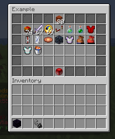
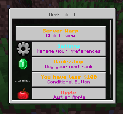
FioMenu has two major GUI families:
- Java inventory and dialogue screens
- Bedrock Floodgate forms
The action syntax is mostly shared between both, but the GUI structure and input placeholders are different.
Java GUI types
The current bundled source shows these Java-facing menu types:
CHESTMERCHANTDIALOGUEANVILBARRELBEACONBLAST_FURNACEBREWINGCARTOGRAPHYCRAFTERCRAFTINGDISPENSERDROPPERENCHANTINGFURNACEGRINDSTONEHOPPERLOOMSMITHINGSMOKERSTONECUTTERWORKBENCH
Java type examples
Standard inventory:
menu:
  title: "<dark_gray>Example</dark_gray>"
  rows: 6
  type: "CHEST"
Merchant:
menu:
  title: "<gold>Merchant Showcase</gold>"
  type: "MERCHANT"

trades:
  1:
    ingredient_1:
      material: EMERALD
      amount: 4
    result:
      material: COOKED_BEEF
      amount: 6
Dialogue:
menu:
  title: "<dark_gray>Dialogue Example</dark_gray>"
  type: "DIALOGUE"
  dialogue:
    behavior:
      contain-exit: false
      escapeable: false
      columns: 1
Workbench-style:
menu:
  title: "<gold>Workbench Showcase</gold>"
  type: "WORKBENCH"
Bedrock GUI types
The Bedrock side uses:
type: "FLOODGATE"
and then chooses one form family through:
form: "SIMPLE"form: "CUSTOM"form: "MODAL"
SIMPLE
Used for button-driven forms.
menu:
  title: "<dark_gray>Bedrock Hub</dark_gray>"
  type: "FLOODGATE"
  form: "SIMPLE"
CUSTOM
Used for mixed input controls.
menu:
  title: "<dark_gray>Dropdown UI</dark_gray>"
  type: "FLOODGATE"
  form: "CUSTOM"
MODAL
Used for accept or deny confirmation screens.
menu:
  title: "<dark_red>Confirmation</dark_red>"
  type: "FLOODGATE"
  form: "MODAL"
Bedrock custom control types
The bundled Bedrock examples show these control styles inside form::
buttoninputdropdownslidercheckmark
button
Common in SIMPLE forms:
'SETTINGS':
  button:
    line1: "<green><bold>Settings</bold></green>"
    line2: "<black>Open preferences</black>"
input
Seen in label_option_ui.yml:
'lorem_ipsum':
  input:
    behavior:
      mustInput: true
      respectBannedChars: true
Returned input placeholder:
%bedrockLabelInput%
dropdown
Seen in dropdown_ui.yml:
'lorem_ipsum':
  dropdown:
    options:
      - 'Survival'
      - 'Creative'
Returned selection placeholder:
%bedrockDropdown%
slider
The bundle shows both slider modes:
- value mode in
slider_ui_value.yml - text mode in
slider_ui_text.yml
Value slider:
slider:
  behavior:
    type: "value"
    value:
      min: 1
      max: 67
Returned placeholder:
%bedrockSliderValue%
Text slider:
slider:
  behavior:
    type: "text"
    text:
      - 'A a'
      - 'B b'
Returned placeholder:
%bedrockSliderText%
checkmark
Seen in checkmark_ui.yml and checkmark_ui_basic.yml:
'afk_toggle':
  checkmark:
    behavior:
      mustRememberValue: true
This is the Bedrock toggle-style control used for boolean or yes/no settings.
Shared action style
Java and Bedrock both use bracketed action syntax in the source bundle.
Common examples:
[OPEN_MENU][PLAYER][CONSOLE][MESSAGE][SOUND][CLOSE][REFRESH]
Java inventory items can scope those action lists by click key:
anyleftrightshift_leftshift_rightqmiddle
The middle key is the middle-click action scope. The current Java source maps both ClickType.MIDDLE and creative clone-wheel clicks to actions.middle.
Actions found in the current bundle
The current bundled YAML examples show these action ids:
[OPEN_MENU][PLAYER][CONSOLE][MESSAGE][SOUND][CLOSE][REFRESH][SET_LANG][SELL_GUI][SCROLL_UP_SORT][SCROLL_DOWN_SORT][CHOOSE_CUSTOM_SLOT][CLEAR_CUSTOM_SLOT][OPEN_SHORTCUT_CHOOSE][CLICK_SET][CLICK_ADD][CLICK_REMOVE][APROMPT][BPROMPT][CPROMPT][SPROMPT]
The bundle also shows helper tokens used inside action chains:
[DELAY=<ticks>][IF_EMPTY]
Action examples
Open another menu
actions:
  any:
    - '[OPEN_MENU] settings'
Handle middle click
actions:
  middle:
    - '[MESSAGE] <gray>Middle Click!</gray>'
    - '[SOUND] UI_BUTTON_CLICK 100 1'
Run a player command
actions:
  any:
    - '[PLAYER] warp market'
Run a console command
actions:
  any:
    - '[CONSOLE] crate openfor %player_name% featured -s'
Send feedback and close
actions:
  any:
    - '[MESSAGE] <green>Done.</green>'
    - '[SOUND] UI_BUTTON_CLICK 100 1 master'
    - '[CLOSE]'
Refresh a Java settings menu
actions:
  any:
    - '[PLAYER] msgtoggle'
    - '[REFRESH]'
    - '[SOUND] BLOCK_NOTE_BLOCK_PLING 100 1'
Prompt input
actions:
  any:
    - '[CPROMPT] [MESSAGE=&7Type your nickname] [REOPEN=true] [COMMAND_EXECUTION=/nick %fiomenuValue%]'
Spigot API references
These are useful when you want to know what standard Bukkit or Spigot values can be used in FioMenu YAML:
If a FioMenu field expects a Bukkit enum such as material, sound, item_flags, enchant, or banner patterns, these Spigot API pages are the safest standard reference for valid names.