Dialogue
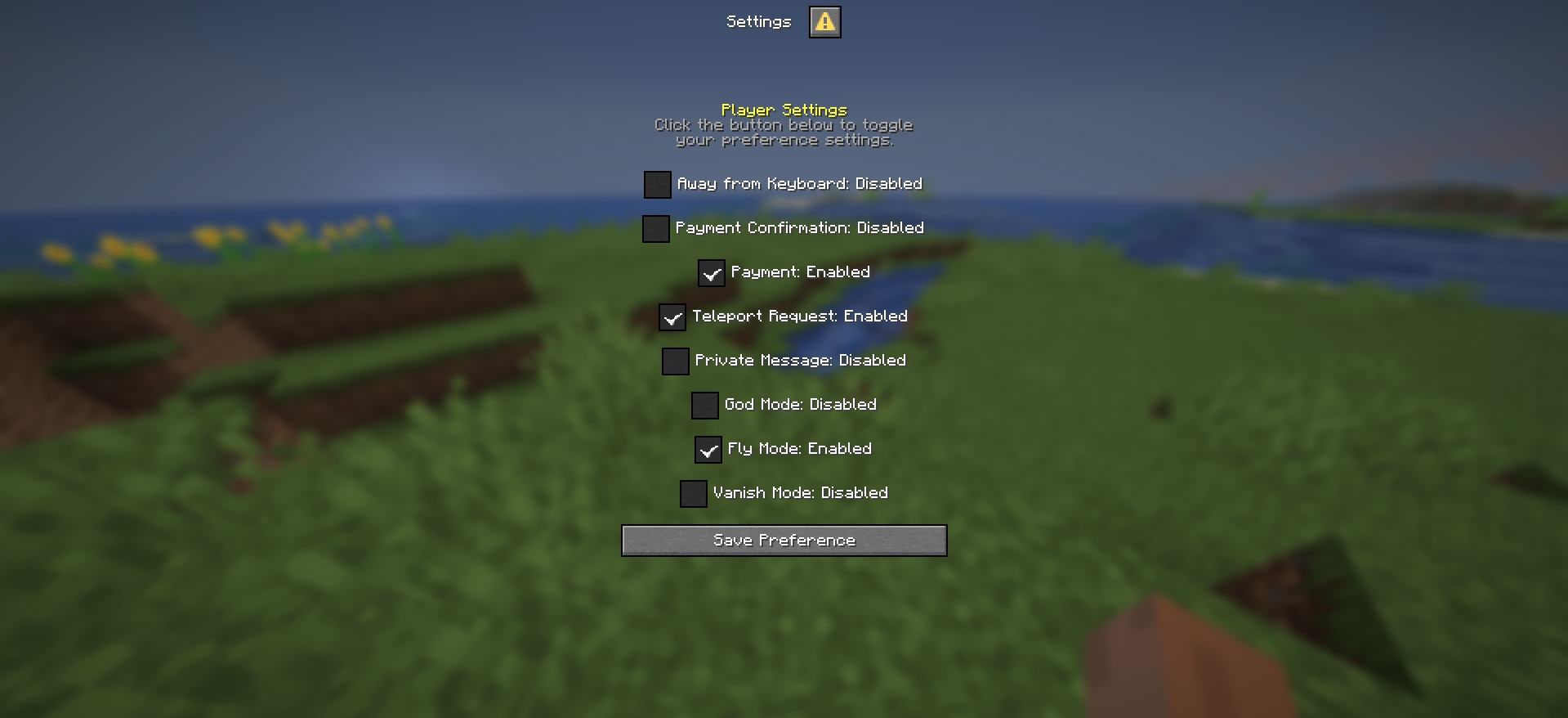
FioMenu's dialogue files are separate from normal inventory menus. They use type: "DIALOGUE" and define layout entries inside a layouts: section rather than a chest-style items: structure.
Core dialogue definition
The bundled dialogue_main.yml uses:
menu:
  type: "DIALOGUE"
  dialogue:
Important dialogue behavior fields shown by the source:
contain-exitescapeablecolumns
These fields control whether the dialogue has an exit option, whether escape closes it, and how many columns the item buttons should use.
Entry ordering
Dialogue files use a priority: list to decide which layouts appear first.
That means the visual order is not inferred from YAML declaration order alone. The priority list is the actual arrangement guide.
Layout types
The source example contains:
- text layouts
- item layouts
- conditional text layouts
- conditional item layouts
Text layouts
A basic text layout uses:
layouts:
  "basic_text":
    type: "text"
    width: 200
    text:
This is used for explanatory paragraphs or static dialogue lines.
Interactive rich text placeholders
The advanced text example uses placeholder blocks such as {thething}, {anotherone}, and {clicktocopy}. Each placeholder can define:
texthovertypevalue
The documented interaction types in the source example are:
OPEN_URLRUN_COMMANDSUGGEST_COMMANDCOPY_TO_CLIPBOARDNONE
Conditional text
dialogue_main.yml also shows a conditional text block under condition.rules0 and condition.rules1.
That allows one dialogue line to render different text depending on a runtime rule such as:
type: "string"
value: "%essentials_msg_ignore% == no"
Item layouts
Item entries inside dialogue are not chest menu slots. They are dialogue item blocks with fields such as:
materialnameloreplayertexture
This is useful when you want dialogue menus to still display item-like visuals without switching back to a full inventory menu.
When to use dialogue
Use dialogue when the interaction should read like a guided panel or native dialog rather than a persistent chest grid. The bundled example is especially useful as a reference for text-heavy menus with clickable inline interactions.