settings.yml
Player settings GUI file: menu/settings.yml.
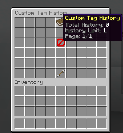
This file defines the personal settings screen used by FioTags players. It focuses on notification toggles and navigation back to the main menu.
Function
settings.yml controls the /fiotags settings menu UI and state-based item rendering.
At runtime it is used to:
- Open the settings inventory layout.
- Render static header + back button.
- Render state-aware notification toggles.
- Resolve player state placeholders in lore text.
- Execute toggle/back actions from click handlers.
Structure
settings:
  title: "<#595959>Settings"
  rows: 6
  items:
    <itemId>:
      slot: <number>
      material: <MATERIAL>
      display_name: "<MiniMessage>"
      lore: []
      item_flags: []
      banner_patterns: []
How to Read This Structure
titlelabels the player settings screen.rowssets the menu size for the toggle buttons and back button.itemsis the fixed button map for this page.- The
<itemId>block shows the common per-item fields that the page uses for each setting button. enabledanddisabledsub-blocks are the important pattern here because they let one toggle render two different visuals.- Use this page to explain how player preferences are stored and how the GUI reflects the current state.
Root Block
settings:
  title: "<#595959>Settings"
  rows: 6
Key behavior:
settings.title: inventory title with MiniMessage support.settings.rows: inventory row count (6 rows = 54 slots).
Items Block
settings:
  items:
    header: ...
    notify-unclaim: ...
    notify-tagtoken: ...
    back: ...
items contains all interactive and informational controls for this settings page.
Shared keys:
slot: inventory slot position.material: Bukkit material id.display_name: item title.lore: descriptive lines.item_flags: optional item flags.banner_patterns: optional banner/shield patterns.
Item Breakdown
header
Static info header item.
Purpose:
- Gives context that this page controls personal FioTags behavior.
- No toggle state logic in this item.
notify-unclaim
State-aware toggle item for unclaim notification.
Structure:
notify-unclaim:
  slot: 20
  enabled: ...
  disabled: ...
Behavior:
enabledsub-block is rendered when unclaim notification is currently enabled.disabledsub-block is rendered when unclaim notification is currently disabled.- Uses
{notify_unclaim_state_colored}placeholder to show current state text in lore.
UI semantics:
- Enabled state uses
LIME_DYEwith "Click to disable". - Disabled state uses
GRAY_DYEwith "Click to enable".
notify-tagtoken
State-aware toggle item for tag-token notification.
Structure:
notify-tagtoken:
  slot: 24
  enabled: ...
  disabled: ...
Behavior:
enabledsub-block is rendered when tag-token notification is enabled.disabledsub-block is rendered when tag-token notification is disabled.- Uses
{notify_tagtoken_state_colored}placeholder to show current state text.
UI semantics:
- Enabled state uses
LIME_DYEwith "Click to disable". - Disabled state uses
GRAY_DYEwith "Click to enable".
back
Back-navigation item.
Purpose:
- Returns player to main tag menu.
- Visual back button in slot
49.
State Rendering Pattern
Two items in this file use conditional visual branches:
notify-unclaim.enabled/ `notify-unclaim.disablednotify-tagtoken.enabled/ `notify-tagtoken.disabled
This pattern allows one logical control to have two fully different visuals, while still representing one setting toggle.
Placeholders Used
{notify_unclaim_state_colored}{notify_tagtoken_state_colored}
Both placeholders are resolved at runtime per player profile state.
Practical Notes
- Keep toggle pairs (
enabled/disabled) consistent in slot and meaning. - Keep lore action hints explicit ("Click to enable/disable") to avoid user confusion.
- If you customize materials, keep color semantics clear (enabled vs disabled).
- Use this menu for player-level preferences only, not admin-level actions.
Actions
This menu is built around two state toggles and one back button:
notify-unclaimtoggles the unclaim notification state for the playernotify-tagtokentoggles the tag-token notification state for the player[BACK]returns to the main tag menu[SOUND] UI_BUTTON_CLICK 1 1 masteris the default click feedback pattern used here
The GUI actions list should stay short in this screen because each button is meant to be a direct state switch, not a workflow chain.
This page is source-backed and includes a short callout so the content reads like a guide instead of plain reference text.