menu.yml
Main player GUI file: menu/menu.yml.
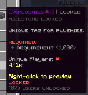
This file controls the primary /fiotags player menu:
- menu title and size
- static utility buttons (settings, sort, filter, category, pagination)
- toggle button state (equipped / no-tag)
- dynamic tag entry slot map
- action dispatch for each clickable item
Function
menu.yml is the runtime layout and interaction map for the default player-facing tag browser.
When a player opens FioTags menu, this file is used to:
- Build inventory UI (
title,rows). - Render fixed utility items in predefined slots.
- Resolve dynamic player/tag placeholders.
- Render paged tag entries in
tag_entries.slot. - Execute action pipeline from each item
actionslist.
Structure
menu:
  title: "<#595959>Tags (%page%/%maxpage%)"
  rows: 6
  items:
    <itemId>:
      slot: <number>
      material: <MATERIAL>
      display_name: "<MiniMessage>"
      lore: []
      item_flags: []
      banner_patterns: []
      actions: []
  tag_entries:
    slot: [list of dynamic tag slots]
How to Read This Structure
titleis the visible inventory title, and it is the right place to keep page counters or other lightweight placeholders.rowssets the size of the main player menu.itemscontains the fixed controls such as settings, custom tag, category, filter, toggle, and pagination.tag_entriesis the dynamic grid where tag cards are rendered into the listed slots.- Use this page to explain the flow from static buttons to dynamic tag cards so the menu feels easy to modify safely.
Root Block
menu:
  title: "<#595959>Tags (%page%/%maxpage%)"
  rows: 6
Key behavior:
menu.title: inventory title, supports color + placeholders.%page%and%maxpage%are replaced at runtime.menu.rows: chest-row count (6 rows = 54 slots).
Items Block
menu:
  items:
    settings: ...
    custom-tag: ...
    custom-tag-history: ...
    info: ...
    sort: ...
    category: ...
    filter: ...
    toggle: ...
    prev: ...
    next: ...
items contains fixed buttons and controls.
Each entry can define visual configuration and action list.
Shared keys used by most items:
slot: target inventory slot index.material: Bukkit material id.display_name: item title.lore: description lines.item_flags: optional item flag list.banner_patterns: optional banner/shield pattern list.actions: action pipeline run on click.
Item Breakdown
settings
Opens settings flow entry and shows notification state placeholders:
{notify_unclaim_state_colored}{notify_tagtoken_state_colored}
Primary action:
[SOUND] UI_BUTTON_CLICK 1 1 master
custom-tag
Starts custom-tag creation flow and shows token status:
{tokens}{token_countdown}
Special behavior:
update: truekeeps item text refreshed while menu is open.
Primary actions:
[SOUND] UI_BUTTON_CLICK 1 1 master[CUSTOM_TAG_CREATE]
custom-tag-history
Opens player custom-tag history screen and shows:
{history_count}{history_limit}
Primary actions:
[SOUND] UI_BUTTON_CLICK 1 1 master[CUSTOM_TAG_HISTORY]
info
Player profile summary button using PlaceholderAPI values:
%fiotag_total_unlocked%%fiotag_locked_total%%fiotag_total_unclaimed%
This item is informational (actions: []).
sort
Sort mode selector button.
Placeholder used:
{sort}
Primary actions:
[SOUND] UI_BUTTON_CLICK 1 1 master[SORTING]
category
Category cycle/scroll button.
Placeholder used:
{category}
Primary actions:
[SOUND] UI_BUTTON_CLICK 1 1 master[CATEGORY_SCROLL]
filter
Filter mode selector button.
Placeholder used:
{filter}
Primary actions:
[SOUND] UI_BUTTON_CLICK 1 1 master[FILTERING]
toggle
State-aware toggle button with two visual sub-sections:
equipped: shown when player currently has a tag equipped.no-tag: shown when no tag is equipped.
Both states use:
- player head texture
- state-specific display text and lore
- action
[TOGGLE]to equip/unequip behavior
prev
Previous page button.
Placeholder used:
{page_prev}
Primary actions:
[SOUND] UI_BUTTON_CLICK 100 1.75 master[PAGE_PREVIOUS]
next
Next page button.
Placeholder used:
{page_next}
Primary actions:
[SOUND] UI_BUTTON_CLICK 100 1.75 master[PAGE_NEXT]
Dynamic Tag Entry Grid
tag_entries:
  slot: [9, 10, ..., 44]
This slot list is the dynamic render area for tag cards. FioTags will paginate and place tag entries into these slots in order.
Action Notes
Actions used in this file:
[CUSTOM_TAG_CREATE][CUSTOM_TAG_HISTORY][SORTING][CATEGORY_SCROLL][FILTERING][TOGGLE][PAGE_PREVIOUS][PAGE_NEXT][SOUND] <SOUND_ID> <VOLUME> <PITCH> <CATEGORY>
Execution is ordered from top to bottom in each actions list.
Compatibility Notes
Supported fallback aliases in menu parser:
rows->sizefallback (rows * 9)display_name-> `nameactions-> `commands
Actions
The main player menu uses the core player action set that powers the GUI actions block:
[CUSTOM_TAG_CREATE]starts the custom tag creation flow[CUSTOM_TAG_HISTORY]opens the saved custom-tag history page[SORTING]cycles the sort mode shown in the menu[FILTERING]cycles the filter mode shown in the menu[CATEGORY_SCROLL]changes the active category view[TOGGLE]equips or unequips the currently selected tag[PAGE_PREVIOUS]and[PAGE_NEXT]move through the tag list pages[OPEN]jumps to another menu id from the button click[BACK]returns to the previous menu[CLOSE]closes the inventory[SET_LANG]changes the active language when the language menu uses it[MESSAGE]sends a formatted message to the player[PLAYER_COMMAND]runs a command as the player[CONSOLE_COMMAND]runs a command as the server console[SOUND] <SOUND_ID> <VOLUME> <PITCH> <CATEGORY>plays click or feedback audio
This page is source-backed and includes a short callout so the content reads like a guide instead of plain reference text.